Number 6

May 7th, 2011

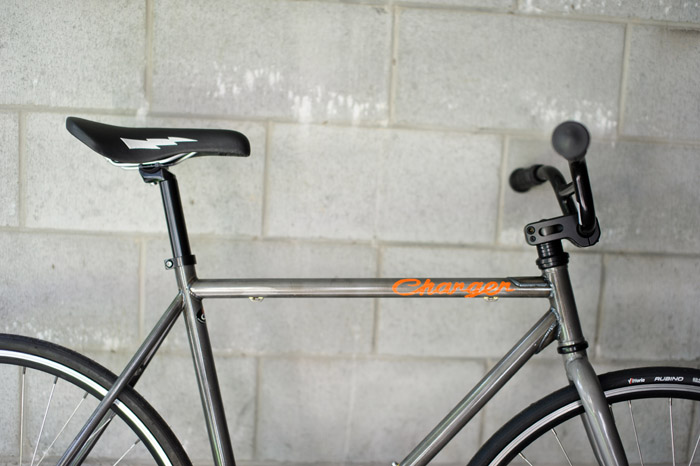
We have been having a bit of a birthday festival over here.  My birthday was on Tuesday and Jason’s was on Thursday.  Flanked either side by my mother’s birthday and mother’s day it makes for an epic week of food, food and more food – followed by cake, cake and more cake.  As we round the corner on the end of the week I thought I’d show you Jason’s birthday present.  I realise that it isn’t very unique or interesting to get him another bike – that makes 6 in total – but he really wanted a fixed gear polo bike and other than clothes (which is the world’s most boring gift to a guy) I couldn’t come up with anything better.  I did, however, come up with a way of adding something to it to make it unique and that is the reason for this post.

Jason has always told me the story of how he came home from hospital in a Valiant Charger.  (I double checked with his mum last night and it is indeed true and not a tall tale!) The Valiant Charger has been one of my all time favourite cars and something we bonded over during our get-to-know-you phase in our relationship.  Since then I have thought about buying one and often trawl through Carsales.com trying to find one but baulk at the level of maintenance it would need and the space we would need to house it.  When Jason started moaning about wanting a polo bike I somehow thought about the Charger – I guess I was thinking valiant stead, Valiant Charger, or something like that.  Then Jason came home from the River City Rollers the other day talking about this guy he had met who is an old-school, hand-painting, sign writer – Rick Hayward from Frank Creates.  BANG – off went my brain!  I had wanted to make Jason’s bike more of a birthday present and this seemed the perfect way to do it.

Rick is one of those people who thinks if it is worth doing it is worth doing well.  The technique he uses would be long forgotten if people like Rick didn’t keep it alive.  Most of the signage we see today is done by computer – it is perfect in every way – the font it uses is just a series of pixels printed by laser to be exact.  There is just something so much better about the signs that Rick creates.  They have emotion and soul – kind of like the difference between listening to a CD and an LP – it is the white noise, the sound of no sound,  that makes all the difference.  The letters look perfect but at the same time they aren’t – and that is the specialness of handmade things really, isn’t it?  They have a patina that no computer can ever really recreate.

I am totally in love with this bike now.  I think it is a thing of absolute beauty as well as being personally significant and funny as well.  Thanks so much Rick!!!  You are a champion.  I also wanted to plug the fact that Rick has an upcoming exhibition of photographs called Tassie by Treadly which is opening on May 14 at 6pm at Black Star Coffee in West End.  It is a $5 entry fee and you get a complimentary drink thrown in – come along, it should be a great night.  I am just so excited about the bike – and so is Jason – the fact that Jason is likely to lose his teeth on it…well perhaps that will just add to its beauty!
Corked It

March 11th, 2011

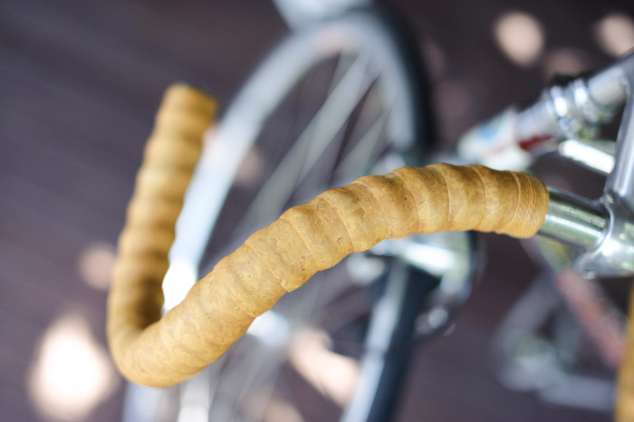
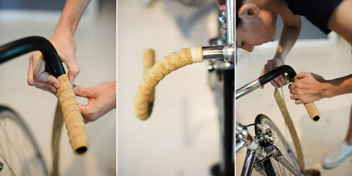
It’s funny how things go – you know, the what’s in and what’s out – especially, especially with cycling.  One minute everyone wants high tech, futuristic, up-to-the-minute, carbon fibre, this-could-be-on-the-next-spaceship gear loaded up with every conceivable bell and whistle and then, without warning, it is all stripped down, pared back, back-to-basics, streamlined, just man and the bike and nothing else.  Those cyclists are a schizophrenic lot…I wonder how they manage to get through a day let alone their whole lives.  Only kidding – Jason is one of those cyclists so I understand it all a bit too well.  His latest edition to the bicycle fold, the Carlton fixie, is a great example of why less is more – just the man and his bike pared back to the basics to produce a seamless ride of purity and oneness with the bike.  At least that is what I am told but to be honest – I just like the look of them.  No cabling, no tricky wheels, no carbon fibre – just steel, chrome and leather.  Well almost, because leather handle bar tape doesn’t survive general wear and tear very well, the handle bar tape he originally had on the bike was utter crap.  Nasty synthetic poorly applied – it hadn’t even lasted a few months before it had completely unraveled.  Inspired by this new blog I have been reading, Wood and Faulk, I thought I could apply this lovely cork bar tape and shellac it to match the colour of Jason’s Brooks seat.  All it needed was a steady hand and a perfectionist’s disposition – that is TOTALLY me!  Matt from Wood and Faulk has some really good links here and here which show you how to wrap your bars and how to tie off the string binding so that it is seamless and strong.  We got our cork bar tape from Rivendell but we also got some Cinelli cork bar on eBay.  However I didn’t use it because I didn’t like the embossed logos all over it.  (Am I becoming one of those cyclists I have been bagging out???  Could it be catching??)

Anyway I won’t go into too much detail but it was actually quite easy.  I have never wrapped handle bars before and was really very nervous about stuffing it up but as long as you go slow and keep the tension tight you really can’t go wrong.  The hardest part by far was tying off the ends but I realised that I could tape them down with some gaff tape while I tied the string to fasten it down and then trim the excess off with a stanley knife.  Easy peasy!

As you can see – and for anyone who has wrapped handle bars before – it was no different using cork to using cloth or plastic.  It is a really nice, natural material and looks just beautiful in its raw state.  I wonder what it would look like if we left it that way.  I’m pretty sure it wouldn’t weather that well but it really was nice.  We have had some issues with the stoppers at the ends – the handle bars are slightly different on each end so one stopper fits and the other is just a little small. We have been debating about putting cork on the end instead of the plastic stoppers – what do you guys reckon?  Yes, no?

The next step was to shellac the cork and string.  The photo above was after one coat of French Furniture Polish (which is premixed shellac flakes and turps) in Dark.  We probably put on WAY too many coats – because we were trying to match the colour of Jason’s seat.  I did some further reading and realised that we could tint it darker so we went for Walnut (with Cedar in between).  If we do it again I would go straight for Walnut and give each coat about 24 hours in between.  (I did email Matt (in a panic!!!) to ask for some clarification and he told me that the shellac resoftens as you apply the next coat and given the humidtity we have here 24 hours would help it really penetrate the cork.)  Jason just applied it with a cloth but I think a brush would have been better.

In the end we did about 12 coats – and that is probably too many – I need to sand and put on the final coat to really make it shine but I am pretty happy with the result. Jason hasn’t been for a ride yet but I am hoping he finds them comfortable…and if he doesn’t?  Tough – sometimes you have to suffer for fashion!  (Thanks Matt for the inspiration and all your help!)

welcome

Studio Sixty Photography is Brisbane wedding photographer Jason Starr, and studio manager Sally Ogilvie.

Well known for creative, natural, candid photographs of both local and international weddings, Studio Sixty Photography is capturing now and forever.


social media


Archives


Subscribe

Sign up for news about latest work, events and special offers!


categories


friends


as seen On

Style Me Pretty

Polka Dot Bride